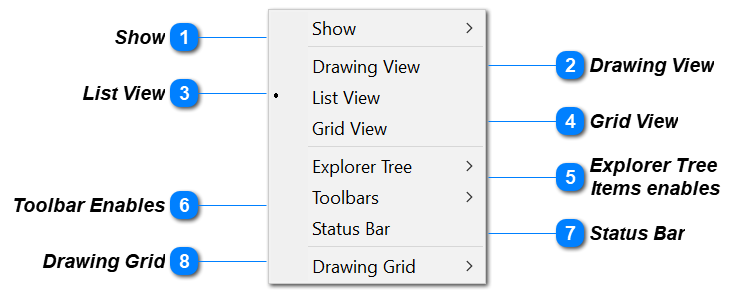
The View Pull-Down menu gives the Analyst selection over various eXpress controls that can be available to the Analyst during modeling. These include controls for Toolbars, Status Bar, Split, Grid and Icons. Note: Design Column Items need to be selected to use these views (Components, Assemblises, IO Flags etc.)
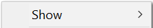
Show
Alternate way of opening Design, Diagnostics, FMECA See View toolbar for preferred ICON select methods
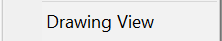
Drawing View
Alternate way of opening Drawing View. See View toolbar for preferred ICON select method
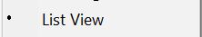
List View
Alternate way of opening List View. See View toolbar for preferred ICON select method
Grid View
Alternate way of opening Grid View. See View toolbar for preferred ICON select method
Explorer Tree
Items enables
Controls what is shown in Design Explorer Tree. Checked Items will be shown. Unchecked Item will not be shown. Entities that have not been developed will show as an empty folder. If Automatic methods are used to create entities then the Explorer tree will automatically turn on the View of this entity in the explorer tree (example: Design States which are defaulted off in the Explorer Tree until they are added.)
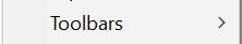
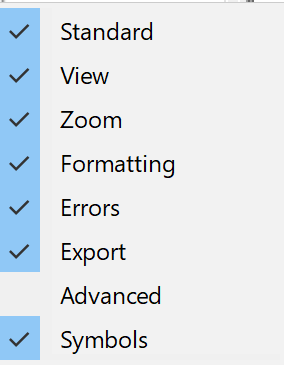
Toolbar Enables
This View Item allows toolbars to be turned off and on [Normally left as shown below (default)]
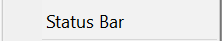
Status Bar
Turns on and off the Status Bar at the bottom of the Design Window [Normally left on (Default)]
This Status bar is very useful to see how many items are selected
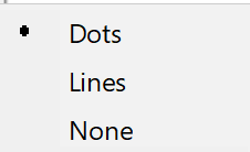
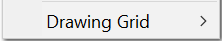
Drawing Grid
Selects background of design window. Normal default is "Dots". This default can be changed in Design Options. Design Pull-Down Menu
Turning "Lines" on can be useful for careful Aligning. "None" is best for saving pictorial of the model.
